

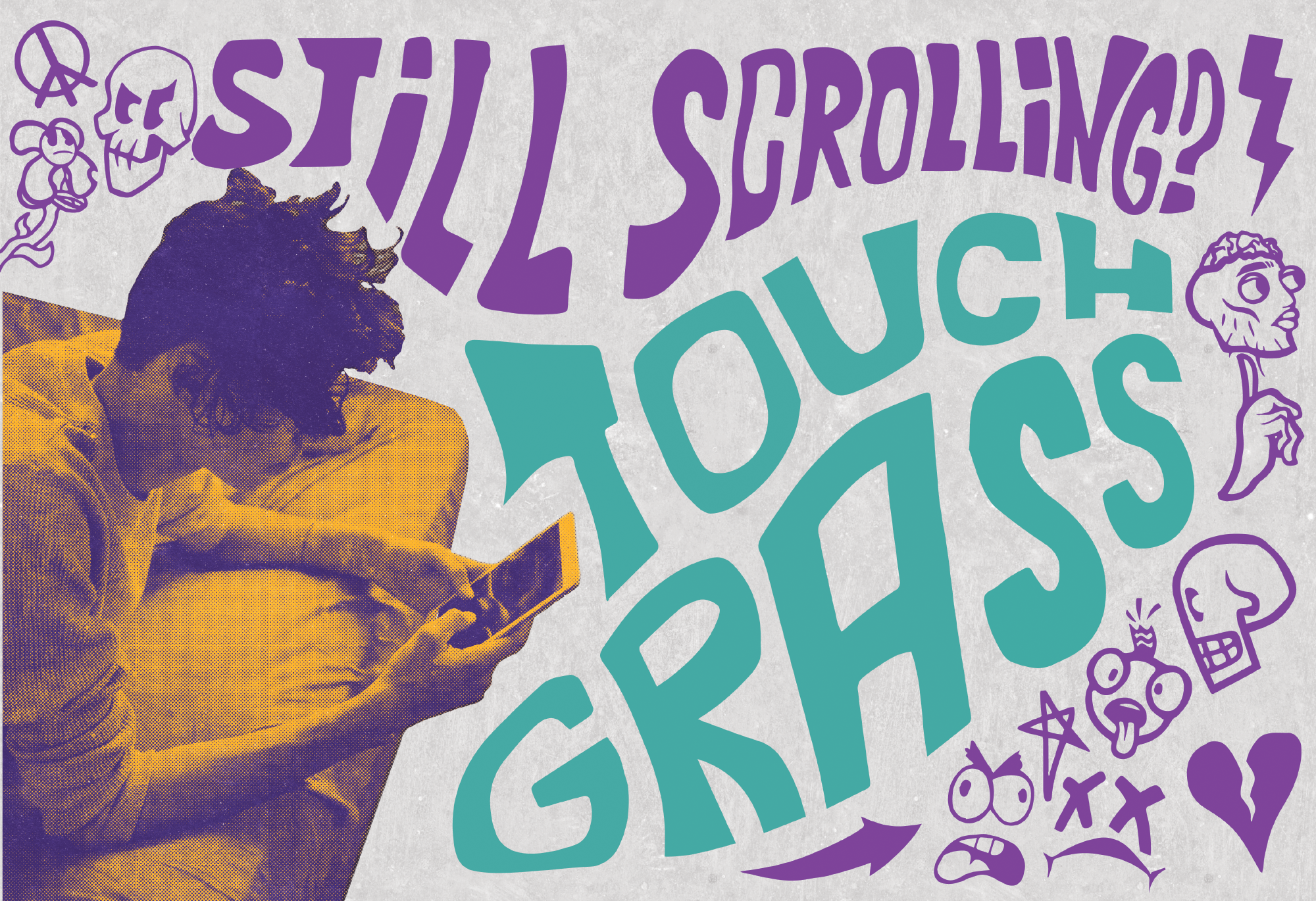
Why Touch Grass
Touch Grass was my capstone project to finish out college, and was one of the biggest projects that I’ve ever taken part in. Regarding how it started, I knew that I wanted to do an awareness campaign as my capstone project. I had two different subjects that I had planned at the start of my final semester, those being an anti-vaping campaign and the other being an anti-social media campaign. I have very strong opinions about both but felt that social media would be a more interesting challenge for me to tackle due to its overwhelming presence in society.
Initial Research
My process was started with developing research that would guide the design in terms of things like my target audience, campaign message, and campaign visuals. To not give a ten page paper on research, the short end is that the most important age group in social media research and its effects were from ages 13-18, where there were several peer reviewed studies that revealed negative effects like insomnia, depression, and eating disorders while also manipulating the developing minds of teens by creating addictive feedback loops. Knowing that, I would create a campaign that aimed to approach a younger audience, with messaging and imagery that would try to resonate with teens ages 13-18 that consume a massive influx of social media.


Type and Illustrations
Now that I knew who I was aiming to appeal to, I had to now approach that audience with messaging that wasn’t going to be some old man telling them “social media bad, stop using phone”. My solution was simply to talk like teenagers, calling them washed, cooked, chopped, or even calling them chuds. At the head of this slang was the popular phrase, “Touch Grass”, which became the figurehead of the campaign.
With the phrasing and general language figured out, I then needed imagery to back up the message. I decided to use a blend of illustrations and photo-editing to push very bold collateral that was in your face and punchy. The illustrations were aimed to pull on a very sketchbook, freehand style that made me think of scribbling in my notebook in high-school classes. The photo-editing was probably the hardest part of this whole campaign, simply due to how many revisions went into getting the imagery right. I wanted to create a feeling that was both striking and yet gave this feeling of the teens feeling isolated. I ended on up using a mix of gradient maps and overlaying a halftone dot pattern over the images to pull on sort of a grungier look.


Final Result and Closing Thoughts
While the campaign was overall well received, I definitely have my areas of improvement for this project. Its reception from teens at the gallery reveal were great, but I felt like it was a bit more attention grabbing than educational. it absolutely got everyone’s attention, but I fear that people weren’t as interested in engaging with the campaign as they were with interacting with it. At the end of the whole project, I still feel great about the work, and I wear the “Touch Grass” hat with pride knowing that I came up with all of this project.

Leave a Reply