

Heirloom
Heirloom was my first assignment focused around creating an advertising campaign. Rather than focusing on branding, this projects objective was consistency. Trying to get an advertising campaign to work together across multiple platforms was everything to this project. For my design I wanted to try to create a campaign focused on playing cards. Its a design that I always wanted to try in college and making a campaign for this kind of product was a perfect opportunity to both practice illustration and experiment with how to make a campaign.
Initial Research
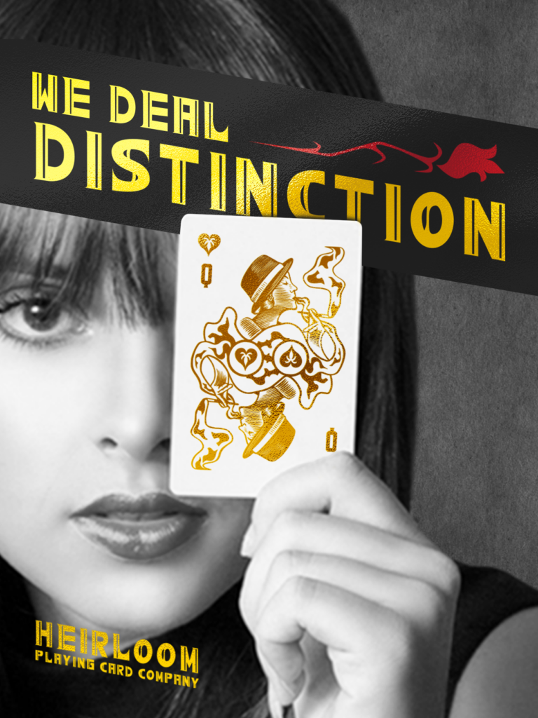
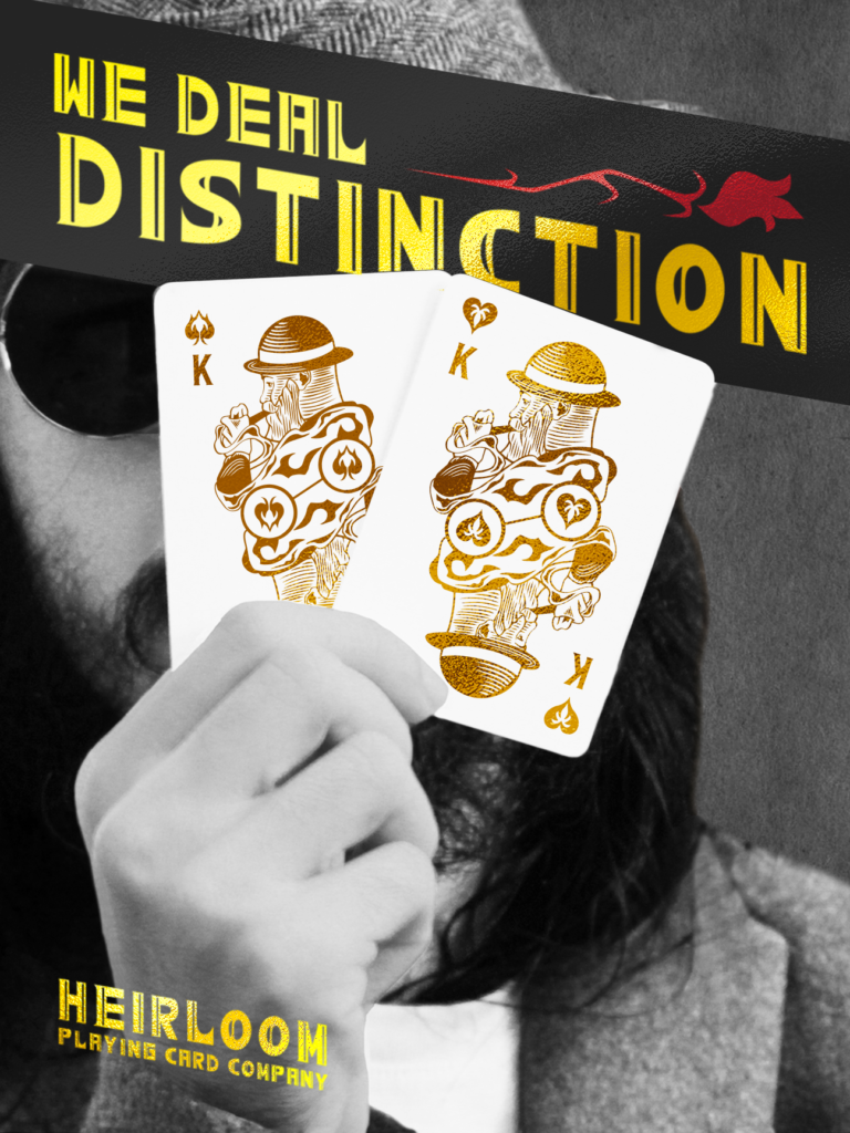
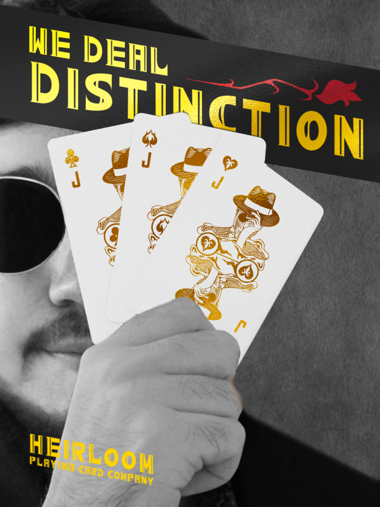
Immediately my first step was understanding campaign design in general, but diving specifically on how other playing card companies would produce campaign designs. My initial research focused on more luxury products and what made their marketing work, and this gave me the idea of promoting the luxury of the work and overall craftsmanship of the product. I pushed this research further into the phrase, “We Deal Distinction”, and then started branding everything with this mindset of luxury and higher class imagery.
Type, Illustrations, and Photography
The type I kept very simple and clean, with a handmade typeface that was designed to be used in an angular fashion to maintain visual interest. I then used a mix of photoshop layers and a gold sheet texture to help push the letters forward.
When it came to the illustration work, I wanted to create visuals that looked traditional, clean, and higher class. I designed the suits for the cards first, then went on to create the face cards, and then finished with the jokers. With each face card, I wanted to create a design that could easily be used for multiple suits.
Finally, the photoshop work was done mostly to help pull focus to the playing cards while cleaning them enough to add my own designs on top of the original cards.
Final Result and Closing Thoughts
Heirloom was one of my favorite projects during my time in college. It had been a blast to create the illustrations and it taught me a very valuable lesson at the end. Too much consistency can be counterproductive, in which my designs definitely looked like they worked together, but it came at a cost of visual interest. Overall, it was a great project to help me later on when I pursued other campaigns to know to shake things up a bit for the sake of keeping interest.
Leave a Reply